Page History
| View diabetes prevalence in your PHN catchment on the map | ||||||
Rationale | Patients diagnosed with diabetes are eligible to register with the National Diabetes Services Scheme (NDSS)1. By identifying the population of people with Diabetes within your PHN or organisation area and viewing it on a map will help you target areas with the highest prevalence of diabetes. | ||||||
Target | Areas in your PHN or organisation with the most people suffering from Diabetes that can be targeted to find out patients that are not registered for NDSS (National Diabetes Services Scheme). | ||||||
PAT CAT Starting Point |
|
1 https://www.diabetesaustralia.com.au/ndss
Aggregated population of people with Diabetes:
- In Filter pane
- Select Conditions tab.
- Click Chronic tab.
- Under Diabetes click the Yes check box.
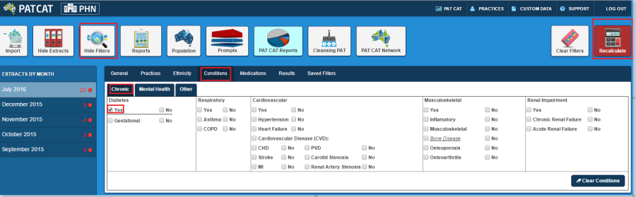
- Click Recalculate
- Click Hide Filters
- In any of the reports from the Reports pane click View Map button.
- In the View Map window
- In the left section you can select the Region Settings, filter your Aggregated Data, and can see the range of the population under Legend.
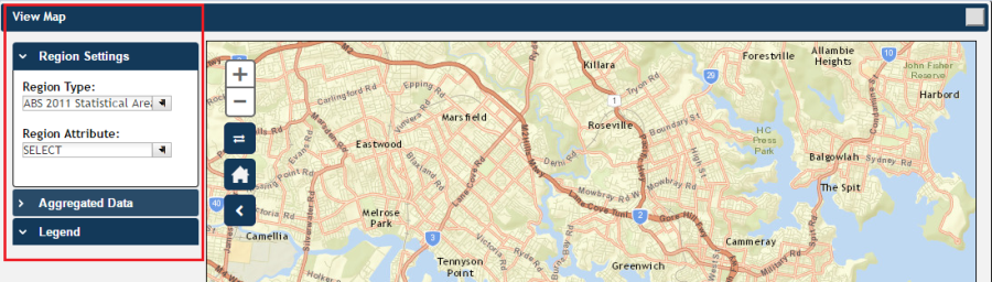
Note: Click here for more information on View Map window.
- Under Region Settings then Region Type select 'ABS 2011 Statistical Areas Level 2 (SA2)', the lowest level of Australian Statistical Geography Standard (ASGS) structure for which estimated resident population, health and vitals and other non-census ABS (Australian Bureau of Statistics) data are generally available.
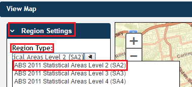
Note: Click here for more information on Region Type.
- Under Aggregated Data click Total Population then select the PHN or other organisation (indicated by your organisation's name) or the individual practice (indicated by the Practice ID). We will select Demo PHN for the purpose of this recipe.
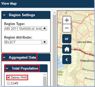
Note: If you are logged on as a practice, you will only see drop downs relating to the entire PHN or other organisation and the practice which you have logged on as.
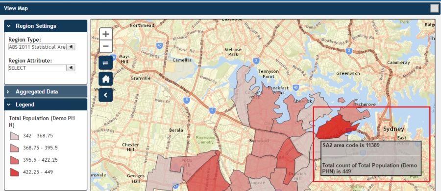
- The Legend is updated to show the colour coded population numbers.
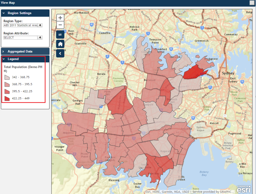
- The map then displays the aggregated population of people with Diabetes for Demo PHN area. Notice that the darker coloured sections of the map indicate a greater population of people with Diabetes.
- Hovering your mouse pointer over a map segment or colour coded section of the map allows you to see the exact Aggregated Data count for that segment.
Note: PAT CAT will not display patients in an area where the number drops below
You can interact with the map:
- Click and drag to move the map.
- Click the + and – to zoom in and out.
- Click the Change Basemap symbol
 to cycle through a range of map types, displaying satellite images, roads, etc.
 - The house
 symbol will bring you to the default Sydney area.