Page History
The CV Event Risk graph displays your data as the % risk of a Cardiovascular Event in 5 years time. It is a guide only based on population health statistics and is useful for clinicians to gain a high level view of patients who are at risk for surveillance.
It is derived from the publication "National Vascular Disease Prevention Alliance. Guidelines for the management of absolute cardiovascular disease risk. 2012" which is available from the websites of the members of the National Vascular Disease Prevention Alliance (Heart Foundation, National Stroke Foundation, Diabetes Australia and Kidney Health Australia).
Anchor
CV Event Risk displays your data as a breakdown of the % 5 Year Risk of a Cardiovascular Event: >=30%, 25-29%, 20-24%, 16-19%, 10-15%, 5-9% and <5%.
The data is displayed as count per age range in a bar chart. Chart functions available are as described for Demographics (Bar Chart).
The graph provides a total population number (the filtered population) and an eligible population number. The eligible population is the number of patients in your filtered dataset that can be assessed for risk ie. patients that do not fall into one of the excluded groups.
The 'Count' on the Count graph will show you the total of the patients graphed – this is the total number of patients where CV Event Risk has been able to be calculated. The eligible population – graph count = patients with incomplete data where no risk can be calculated. These patients are displayed on the second tab.
...
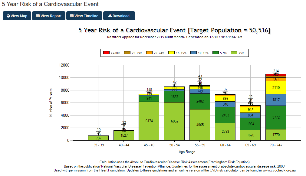
Figure 111: CV Event Risk Count Chart
...
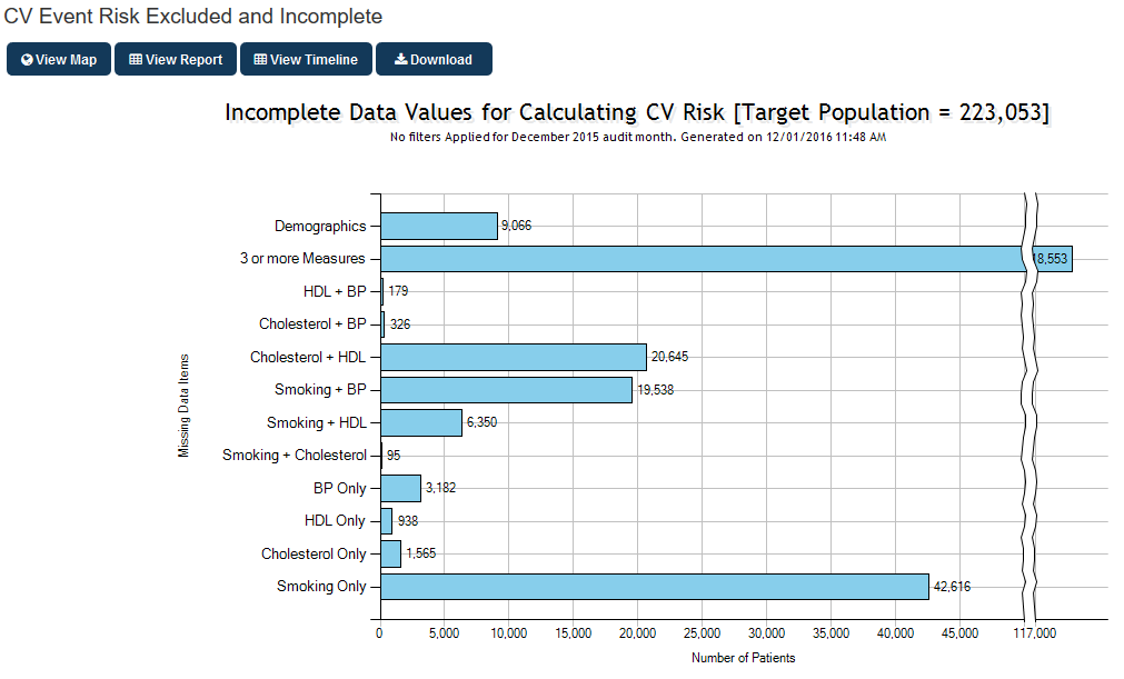
Figure 112: CV Event Risk Excluded and Incomplete Chart