Page History
Custom timeline reports allow to combine data from multiple reports in a timeline. This can be useful to see how a project targeting one particular risk factor (i.e. Smoking) has affected a health indicator (i.e. blood pressure) over time. An organisation running projects focussing on any number of health indicators or risks will be able to see the outcomes for selected patient groups and/or practices over time and so will be able to see how effective the project has been.
To access the custom timeline reports, please click on the Reports icon on the top of your screen and choose the 'Custom Timeline' option:
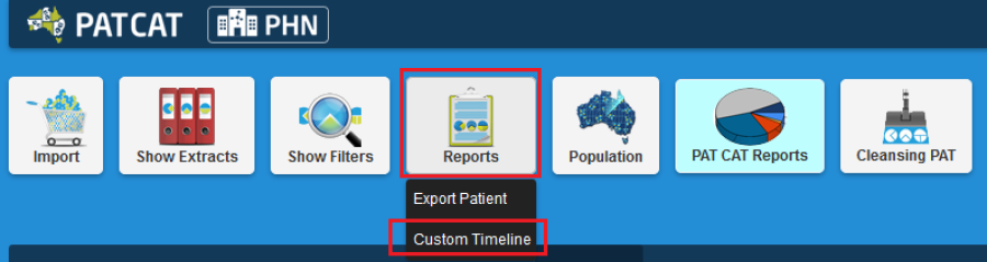
Figure 152: Access Custom Timeline
This will open a new window providing access to all indicators in your data and you can pick which indicator(s) to view in the timeline by clicking the tick-boxes. Ticking the top level box will select all indicators for the selected report and by clicking on the > you can expand the report title to select individual results only. In the example below only high BP and high Cholesterol is selected.
NOTE: The timeline will be affected by any filter that has been applied to your data.
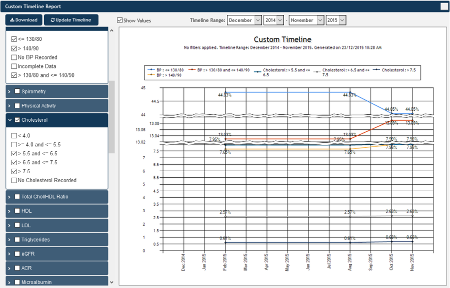
Figure 153: Custom Timeline BP and Cholesterol
The "Download" button provides the same functionality as in the standard timeline – it will save an image of the graph for use in other documents. The 'Show Values' tick box allows to show each data point on the graph as pictured. To apply this you will need to click the 'Refresh' button after selecting to show the values.