Page History
...
Overview | The CDSA Tool has been developed to report on the completeness of patient demographic and health summary data within the general practice clinical system. It provides the following reports:
| ||
Data | The data indicators are based on the data content outlined in the RACGP data recommendations http://www.racgp.org.au/ehealth/summary
| ||
Data Quality Dashboard |
| ||
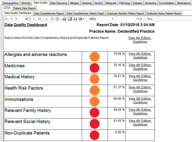
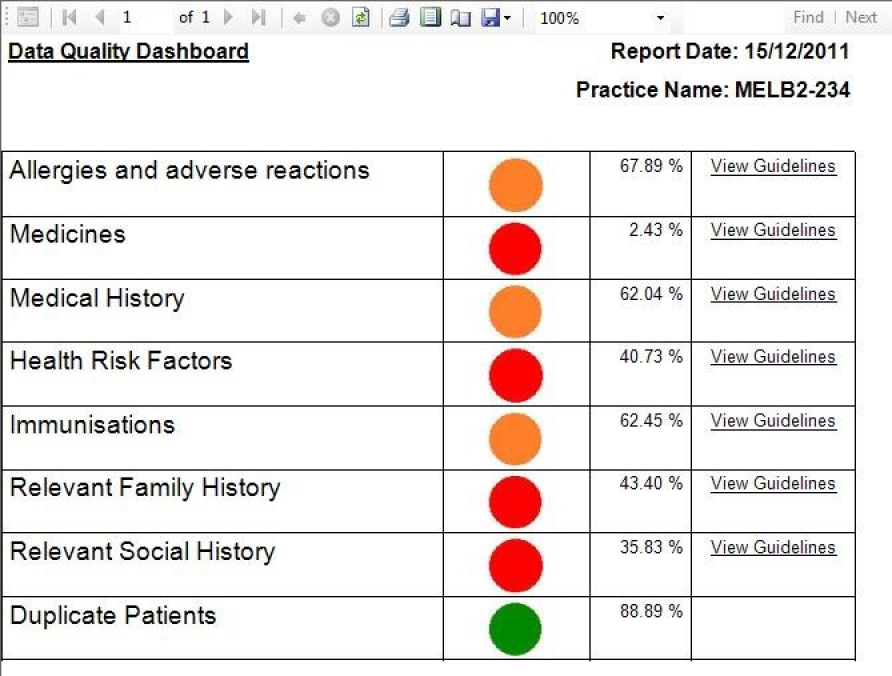
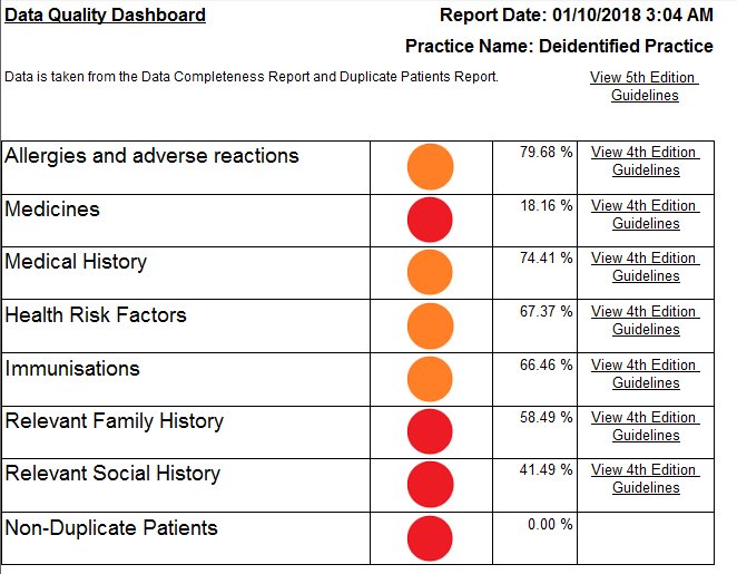
Data Quality | The Data Quality Dashboard provides a report indicating the overall status of data quality based on the data indicators. It displays each data content section with a 'Traffic Light' status icon updated fact sheets for the 5th Edition of their guidelines, but the recommendations have not changed.
|

Data Completeness Reports |
|
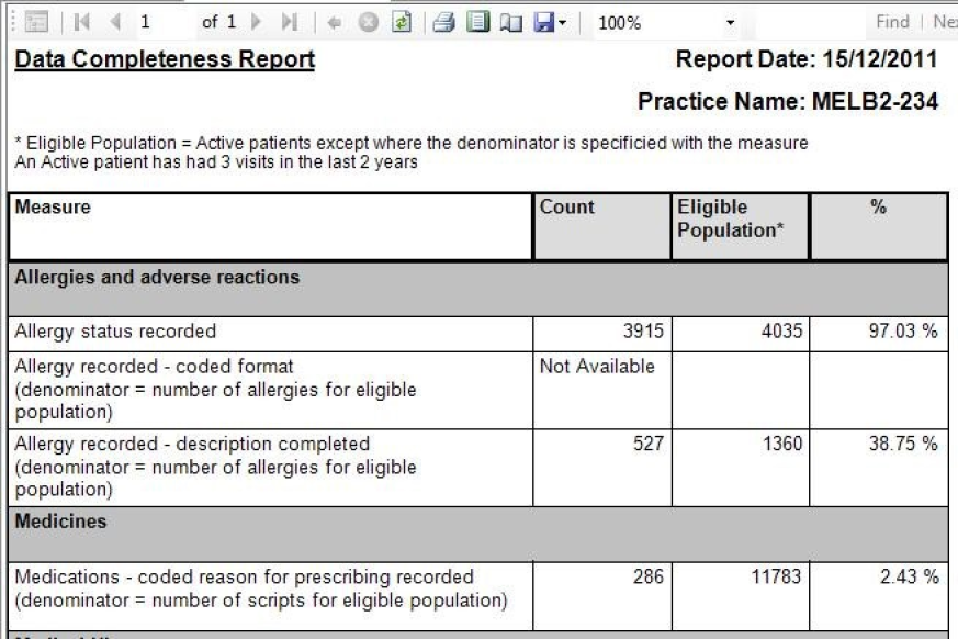
Data Quality | The Completeness Report provides a % of completeness for each data indicator.
|
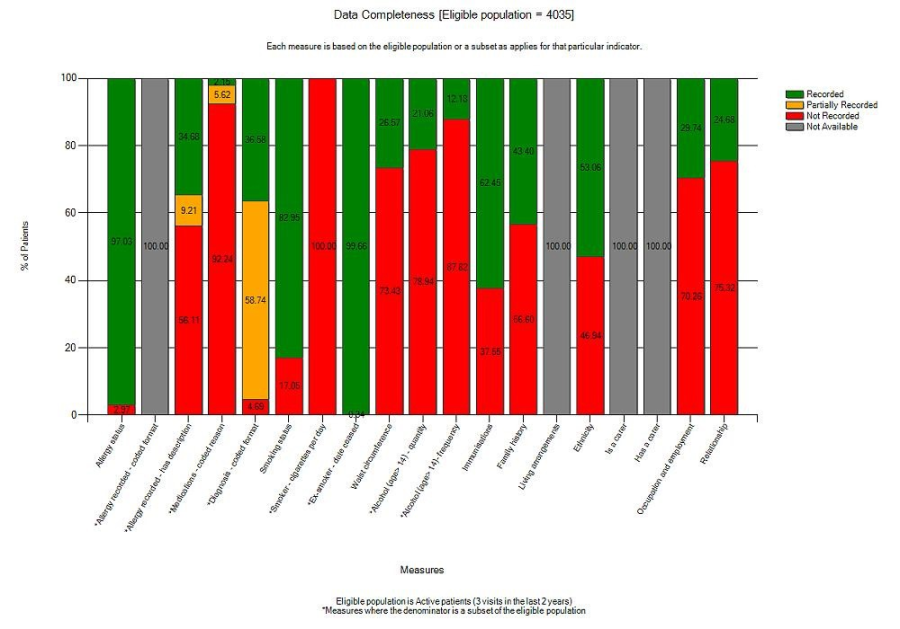
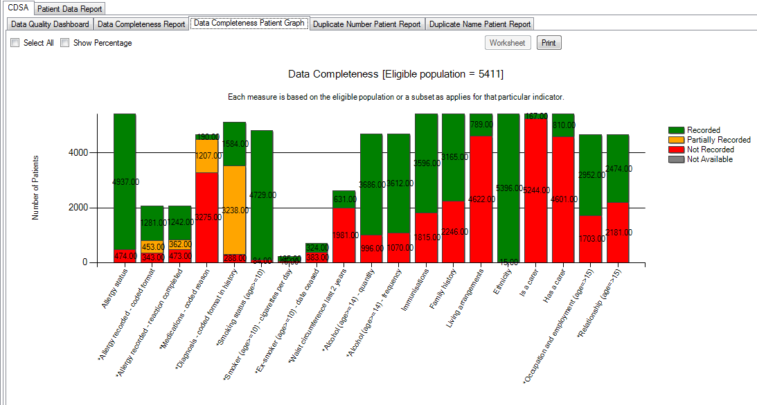
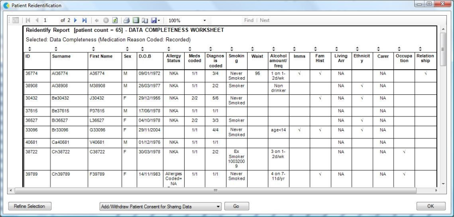
Data Quality | The Completeness graph provides a graphical view of the data indicators by patient and allows re-identification of patients where data is missing.
|
Data | Patient data can be exported from the Data Completeness Graph using the 'Worksheet' button.
|
...