The Aggregated Data drop down allows the user to select which information from the data extract to display on the map. This is based on the report screen used to click on the 'View Map' button.
The example shown below overlays information related to Smokers with chronic conditions (in this instance Respiratory for the entire PHN or other organisation) from the extract data, and ABS data in relation to socio-economic disadvantage.
- Set the filters to Conditions > Chronic > Respiratory

Figure 128: Respiratory Conditions Filter
- Click Recalculate
Figure 129: Recalculate Button
- Go to the Smoking tab in the Reports pane.
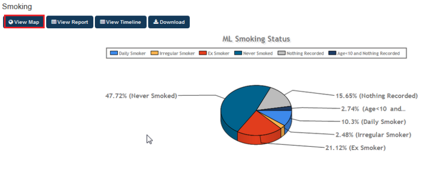
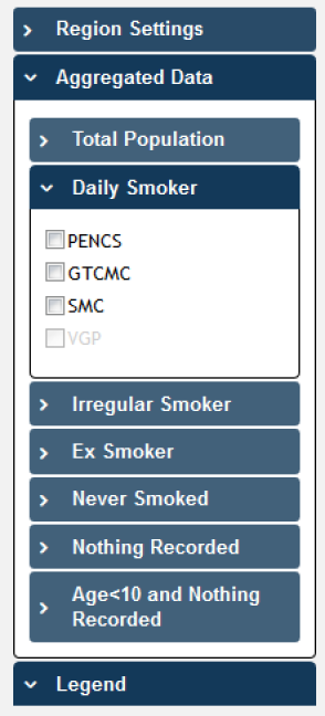 Figure 130: View Map Smoking Report
NOTE: The filter applied for this graph is Conditions: (Respiratory = YES)
Click the View Map Button.
- In the View Map window, open the Aggregated Data
drop down menu
Figure 131: Aggregated Data Map View
You can select the total aggregated data for the PHN or other organisation (indicated by your organisation's name) or the individual practice (indicated by the Practice ID).
NOTE: If you are logged on as a practice, you will only see drop downs relating to the entire PHN or other organisation and the practice which you have logged on as.
Click on Daily Smokers (PENCS) and Irregular Smokers (PENCS).
The aggregated data information will now be displayed on the map and the legend is updated (located in the bottom left portion of the window).
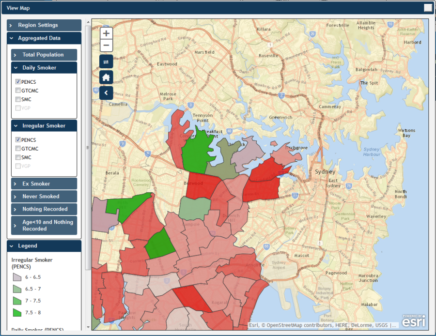
Figure 132: View Map Example (Smoking Data)
The map legend (displayed in the bottom left) is dynamic and determined by the selections made from the drop down menus, in this instance Daily and Irregular Smokers in the PENCS area.
Observe that the darker coloured sections of the map indicate a greater number of smokers with respiratory conditions in that region. Remember that all filters applied prior to using the map will affect the population mapped on the report.
- Open the Region Type drop down menu and select ABS Statistical Level 2 (SA2).
Open the Regions Attribute drop down menu and select IRSD State Percentile (N) (Index of Relative Socio-economic Disadvantage)
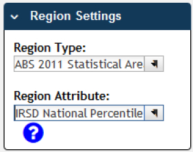
Figure 133: IRSD National Percentile
The selected attribute is now added to the map in the bottom section of the window.
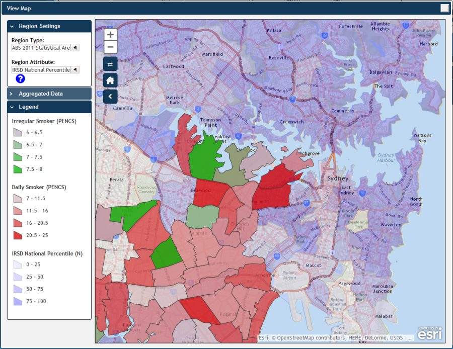
Figure 134: View Map Example (Smoking and IRSD National Percentile Data)
Observe that the map legend is now showing both Region Attribute and Aggregated Data as selected from the drop down menus, IRSD National Percentile (N) and Smoking (PENCS) respectively for the filtered population (patients with chronic respiratory conditions). In the example shown darker blue coloured sections indicate a greater IRSD State Percentile figure.
Observe further that there is a cumulative application of the legend colours, with areas representing the same Smoking numbers appearing slightly darker/more purple where the IRSD National Percentile level is greater.
Hovering your mouse pointer over a map segment allows you to see the exact Aggregated Data count for that segment.
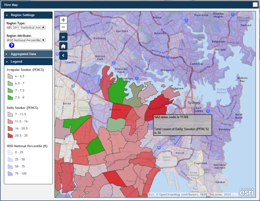
Figure 135: View Map Mouse Hover Example (Smoking and IRSD National Percentile Data)
You can interact with the map; clicking and dragging to move the map, clicking on + and – to zoom in and out, and clicking on the Change Basemap symbol ![]() to cycle through a range map types, displaying satellite images, roads, suburb names, etc.
to cycle through a range map types, displaying satellite images, roads, suburb names, etc.