PAT CAT allows users to import their own data to display in the Timeline reports described in the next chapter. This can be used to display national benchmarks as a comparison, use data from other sources than the de-identified CAT data and allows users to customise their timeline reporting. Hospital data such as admissions and diagnosis reports is another example – this is a very flexible tool for your reporting needs, feel free to explore the options.
Using custom data has a number of rules and restrictions that are important to understand to use it correctly:
- Data has to be in comma delimited format (csv)
- There has to be at least one column with measures (values) and at least one column with a date
- Values have to be numerical only
- Multiple value columns can be selected but only one date column can be used
- Data will be aggregated if more than one value/month is available, which may cause strange results, so make sure you have edited your source file accordingly. Example if you looking at blood pressures and have multiple results for one month (in different rows) the individual results will be added for the month which wouldn't make sense. To use data like this you will need to average the data over the month.
- Once imported, the custom data will be available for display on the individual and custom time line graphs, by default the custom data is shown at the bottom of the indicators to be graphed.
For this example we are using a custom data file containing mock diabetes prevalence rates – these are not accurate and are only used to illustrate the usage of the custom data file
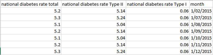
Figure 137: CSV Custom Data File