Every report tab has the options below to work with the data represented as a graph in the report.
- View Map will open the map view - please see VIEW MAP FUNCTION for full details
- View Report will show the data in a table as detailed below
- View Timeline will show a line graph - please see TIMELINE REPORTING for full details
- Download will download the data in CSV format - please note that all filters will be applied to the downloaded data, but not your show/hide column preferences
Clicking on View Report will open a new window to show the data specific to the report selected. The example below is from the 'Smoking' report.
The first two columns show the aggregated data (numbers and %) for your organisation and the next two columns show the 'Adjusted' totals and percentage. Please see this page for more details on how the adjusted column works and how it can be used when combined with filters.
The Benchmark Report can be saved as PDF file, by clicking the 'Save PDF' button in the top right hand corner of the report pane.
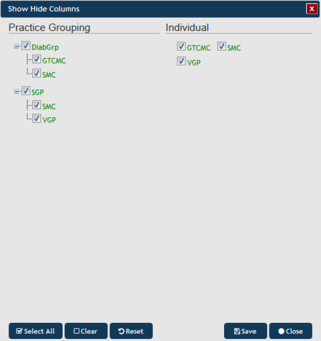
The button allows you to customise which columns are displayed – this makes working with large numbers of clinics easier:
Regardless of the Show/Hide settings you have applied, the export to CSV will always export all columns.
NOTE: If you are logged on as a practice, you will still see the Org and Adjusted columns in the 'View report', but you will only see the population for the practice which you have logged on as.
Clicking on View Map will allow for the information to be mapped, functions are described in the View Map Function chapter
Clicking on the 'View Timeline' button will allow you to see the report data (filtered or unfiltered) for all uploaded extracts plotted over time, please see Section 10 for more details


