Every report tab has the options below to work with the data represented as a graph in the report.

Figure 93: Report Data View Options
Clicking on View Report will open a new window to show the data specific to the report selected. The example below is from the 'Smoking' report.
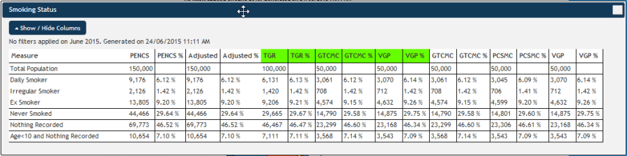
Figure 94: View Report Example
The first two columns show the aggregated data (numbers and %) for your organisation and the next two columns show the 'Adjusted' totals and percentage. The number in the 'Adjusted' column is based on a 'virtual' patient to provide complete data without counting patients more than once. Patients who have visited more than one clinic in an organisation's catchment will be counted more than once in the Org column (eg PHN, PENCS or etc) as their data is included in each upload from the individual clinics.
The 'Adjusted' column will use the most recent visit on record as a starting point for the virtual patient and remove all other instances of patients with more than one visit. Then PAT CAT will find missing/incomplete fields for the patient in the data uploaded from other clinics and attempt to complete the virtual record.
For example if you have a patient who visited 3 clinics who all uploaded their data to PAT CAT and only one of the three clinics has a diagnosis of diabetes on file, PAT CAT will use the patient record with the most recent visit date. PAT CAT will then go through all reported indicators and check if there are results missing from the most recent record. Anything missing from the original record will be completed using data from the other visits of the patient. If there is more than one result available, the most recent one is used.
This creates a single virtual patient with all available and most up to date information from all clinics visited in the current reporting period.
The Benchmark Report can be saved as PDF file, by clicking the 'Save PDF' button in the top right hand corner of the report pane.
The ![]() button allows you to customise which columns are displayed – this makes working with large numbers of clinics easier:
button allows you to customise which columns are displayed – this makes working with large numbers of clinics easier:
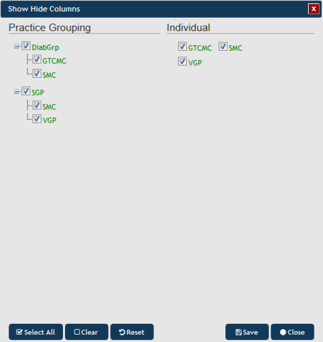
Figure 95: Show/Hide Columns
NOTE: If you are logged on as a practice, you will still see the Org and Adjusted columns in the 'View report', but you will only see the population for the practice which you have logged on as.
Clicking on View Map will allow for the information to be mapped, functions are described in the View Map Function chapter
Clicking on the 'View Timeline' button will allow you to see the report data (filtered or unfiltered) for all uploaded extracts plotted over time, please see Section 10 for more details