The imported custom data is now available in the individual timeline reports as well as in the custom timeline reports. For full details on timeline reporting please see the next chapter.
As we have imported a file with national diabetes prevalence rates, we will have a look at the 'Disease' report and add our custom data to the timeline. To see the timeline report, click on the 'Disease' report tab, then on the 'View Timeline' button.
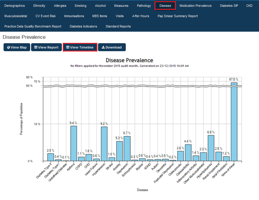
Figure 146: Disease Prevalence Report
The timeline report window has the timeline for the selected report as well as the custom data – in the example below I have removed all but the type II diabetes figures to make the graph less crowded.
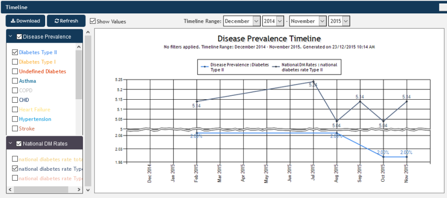
Figure 147: Custom Data Timeline
To use the custom data in the custom timeline just add it to the graph by selecting one or more indicators from the very end of the custom timeline report window.
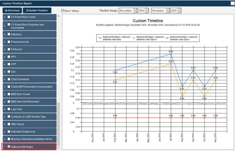
Figure 148: Custom Data in Custom Timeline Report